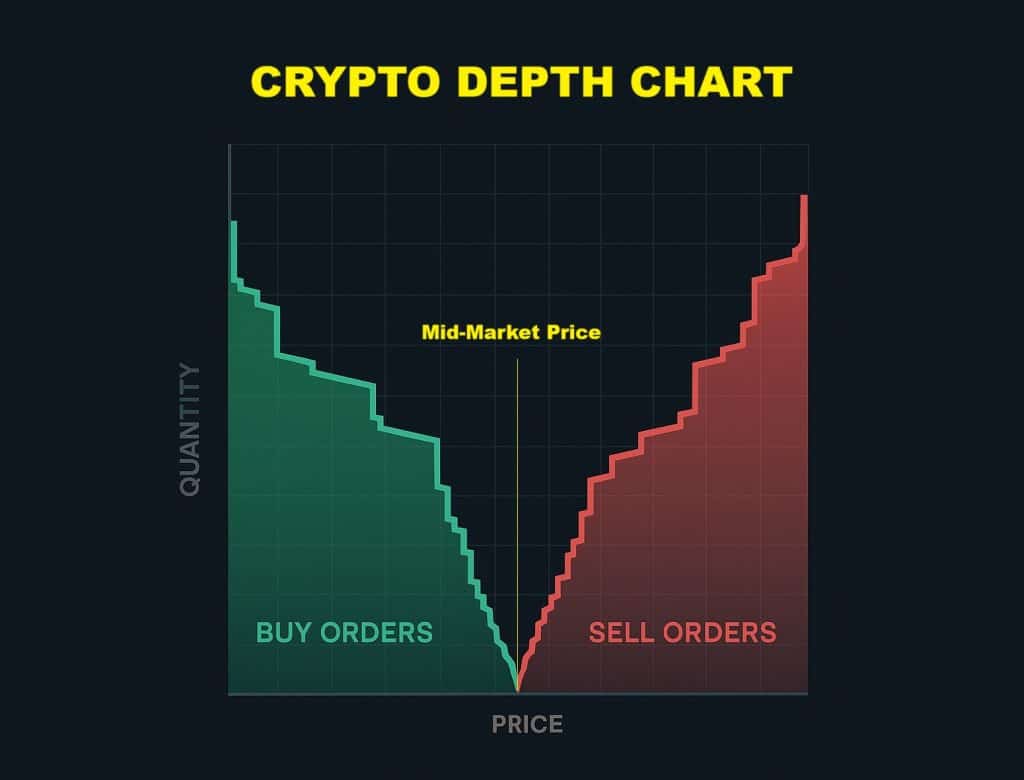
Depth charts visualize crypto market supply and demand by plotting buy (green) and sell (red) orders from an order book. Prices appear on the horizontal axis, while the vertical axis shows order quantities. This helps traders spot liquidity concentrations and price trends at a glance.
These charts are important because they reveal liquidity, stability, and sentiment. Thick order clusters suggest price support, resistance levels, and market depth, which are key for predicting volatility. Shallow markets risk sharp price swings, while deep markets absorb large trades smoothly. Charts also expose manipulation tactics like fake orders, helping traders strategize entries, exits, and risk management.
Depth charts are used by retail investors to make data-driven decisions, professional traders timing trades, analysts assessing market sentiment, and algorithmic systems automating strategies. Market makers depend on them to balance liquidity.
Key Takeaways
- Depth charts show buy and sell orders at different price levels, helping you understand where supply and demand are strongest.
- Large buy walls suggest price support, while large sell walls suggest resistance, which can influence short-term price direction.
- Traders may place fake orders (spoofing) to create the illusion of support or resistance. Depth charts have to be read alongside other indicators for more reliable analysis.
What You Need to Know About the Depth Chart
A depth chart is a visual tool in crypto trading that maps supply (ask orders) and demand (bid orders) for an asset across price levels. In the following sections, we’ll explain its key elements: how bid and ask orders shape the chart, how it differs from the order book, and the role of price and volume axes.
Bid and Ask Sides
The depth chart’s bid and ask sides reflect the market’s buying and selling intentions. Bid orders, shown in green, represent buy requests placed below the current price, indicating what traders are willing to pay. Ask orders, shown in red, are sell orders positioned above the current price, reflecting sellers’ target prices.
These orders are visually aggregated into two lines: the bid line ascends left to right (cumulative buy orders), while the ask line descends right to left (cumulative sell order).
Order Book vs. Depth Chart
The order book and depth chart are interconnected but have different purposes. The order book is a text-based list of individual orders, showing exact prices and quantities for precise trade execution. The depth chart, however, transforms this raw data into a visual graph, focusing on broader trends like liquidity distribution and sentiment.
Traders use the order book to pinpoint specific support and resistance levels or detect manipulation through irregular order sizes. In contrast, the depth chart is better at revealing market depth, such as buy/sell walls in large order clusters and assessing overall stability. For example, a depth chart might show a thick bid wall at a lower price, hitting at strong support, while the order book provides the exact size of those orders. Using these tools together allows traders to balance small details with strategic overviews.
Price Axis vs. Volume Axis
The depth chart’s horizontal (price) and vertical (volume) axes show market dynamics. The price axis shows potential price levels, while the volume axis quantifies the cumulative orders at each level. The shape of the volume curve is very important: thick volume near the current price indicates stability, as many orders can absorb large trades without significant price shifts. Sparse volume, however, shows volatility risk.
For example, a steep bid slope (rising volume at lower prices) suggests bullish sentiment, whereas a steep ask slope (rising volume at lower prices) suggests bearish pressure. Sudden volume spikes, like walls of orders, may indicate manipulation, such as spoofing, where large orders are placed to trick the market.
By analyzing these axes, traders can identify price floors (support) and ceilings (resistance), adjust for slippage, and anticipate market reactions to large trades. This dual-axis insight is critical to managing risk and capitalizing on trends.
How to Read and Interpret a Depth Chart
Below, we’ll break down three key elements for interpreting depth charts: the midpoint (market price), order book walls, and slope and shape patterns. Understanding these components helps traders effectively identify trends, spot manipulation, and time their trades.
The Midpoint or Market Price
The midpoint, or market price, is the current trade price of an asset, represented by a vertical line separating the bid (buy) and ask (sell) sides of the depth chart. Prices to the left of this line reflect the buy orders, while those to the right show the sell orders. The gap between the highest bid and the lowest ask, the spread, reveals liquidity and transaction costs.
The spread is narrow in stable markets, indicating high liquidity and low volatility. During volatile conditions, the spread widens as buyers and sellers disagree on price, increasing transaction risks.
For example, a sudden news event might cause the ask side to spike, pushing the midpoint higher and widening the spread. Traders monitor these dynamics to estimate immediate price action and slippage risks.
Order Book Walls
Order book walls are large groups of buy and sell orders at specific price levels. Buy walls are steep green cliffs on the bid side, showing strong support where buyers want to prevent price drops. Sell walls, shown as red cliffs on the ask side, act as resistance, capping price rises.
These walls often reflect strategic behavior: institutional traders might place buy walls to accumulate assets at a lower price, while sellers use walls to offload holdings without crashing prices. However, walls can also confuse traders. Whales may place fake orders, a strategy called spoofing, to manipulate sentiment, only to remove them before execution.
Identifying real walls involves checking if orders persist during price tests. For instance, a buy wall holding firm during a dip suggests real demand, while a disappearing wall hints at manipulation.
Slope and Shape Patterns
The slope and shape of the depth chart’s curves reveal liquidity and market sentiment. A steep slope near the current price indicates dense orders, suggesting stability and high liquidity. On the other hand, a gradual slope or flat areas imply fewer orders and volatility risks, as fewer trades can trigger sharp price differences.
The overall shape also matters: a U-shaped chart (balanced bid/ask curves) signals equilibrium between buyers and sellers, while a flat or lopsided shape indicates the opposite. For example, a steep bid slope paired with a flat ask slope indicates bullish dominance, as buyers are more than sellers. Sudden irregularities, like isolated spikes or asymmetrical walls, can indicate spoofing or panic.
What Does a Depth Chart Tell Us About The Market’s Behavior?
A depth chart highlights liquidity conditions, identifies support and resistance zones, and reflects market sentiment. These elements help traders estimate stability, predict price movements, and understand collective trader psychology.
Liquidity
A depth chart’s visual cues make liquidity easy to assess. High liquidity appears as thick, dense curves near the current price, where large volumes of buy and sell orders are together. Markets like BTCÚSDT often show this, allowing large trades without significant price shifts and keeping a tight bid-ask spread. On the opposite, low liquidity is marked by sparse, shallow curves, more common in niche altcoin pairs, where even small trades can result in volatility and wider spreads.
Liquidity also varies between trading pairs and platforms. Well-known pairs on high-volume exchanges such as Binance typically have deeper order books, while smaller platforms or less popular assets may have thinner liquidity. Traders usually prioritize liquid markets to minimize slippage, but shallow markets can offer opportunities for quick gains and losses during volatility.
Support and Resistance Levels
Large order clusters on a depth chart create psychological and strategic price zones. Buy walls show strong demand, acting as support where prices may rebound. For example, a wall at 30,000 BTC suggests buyers will defend that level aggressively. Sell walls indicate resistance, where sellers cap upward momentum, like a wall at 31,000, indicating a rally.
These walls are not always static. Institutional players can place temporary walls to manipulate prices, only to remove them once retail traders react. Real support and resistance levels resist through price tests while spoofed walls crumble under pressure. Traders watch for walls that hold during volatility to confirm their validity and play their entries and exits accordingly.
Market Sentiment
The depth chart shape directly reflects whether the market is bullish or bearish. A bullish bias happens when the bid side is bigger, with steeper slopes and larger volumes than the ask side. This shows traders are eager to buy, anticipating price rises. On the opposite side, a bearish tilt shows the ask side overcoming bids, suggesting selling pressure and potential declines.
Order origins also shape sentiment. Retail traders usually place smaller, divided orders, while institutions leave “whale-sized” walls. Sudden spikes in sell orders might indicate institutional profit-taking, whereas retail-driven markets may show smoother curves. However, fake walls or abrupt order cancellations can distort sentiment, as manipulators exploit the chart to trigger panic or FOMO.
How Do Traders Use Depth Charts?
Scalpers, swing traders, and algorithmic systems can use depth charts to inform decisions, manage risk, and optimize execution across varying timeframes and objectives.
Scalping and Day Trading
Scalpers and day traders depend on depth charts for quick decisions. By monitoring real-time order book liquidity, they find clusters of buy or sell orders that act as immediate support or resistance. For example, an unexpected spike in buy orders at a specific price (a buy wall) might indicate a short-term bullish moment, incentivizing a scalper to enter a long position. On the other hand, a fallen sell wall could indicate a bearish shift, triggering an exit.
Traders also look for quick wall shifts and order spoofing. A steep bid or ask curve close to the current price suggests high liquidity, reducing slippage risks during quick trades. However, shallow curves warn of volatility, requiring tighter stop-losses. By following how walls form or dissolve, scalpers profit on micro-trends, usually holding positions for just a few minutes.
Swing Trading and Position Management
Swing traders use depth charts to estimate trend sustainability. Large buy or sell orders at key levels help identify support and resistance zones, which often align with psychological price points, round numbers like $50,000 for Bitcoin for example. A persistent buy wall might indicate a strong support level, encouraging traders to hold positions during pullbacks.
Combining depth charts with volume analysis and technical indicators, such as moving averages, improves accuracy. For example, a breakout above a sell wall with rising volume confirms bullish trends, validating a long entry. Traders follow depth pressure to predict reversals, whether bid or ask to dominate over time. If the bid curve gradually flattens while prices rise, it may show exhaustion, prompting profit-taking. This hybrid approach balances short-term order flow with broader market trends.
Algorithmic Trading
Algorithmic systems process depth charts at impressive speed to execute strategies. Bots detect liquidity pools and imbalances, placing orders milliseconds ahead of competitors. For instance, a market-making algorithm might continuously adjust bid/ask spreads based on real-time depth data to profit from the spread while managing inventory risk.
High-frequency trading (HFT) bots take advantage of micro-price differences revealed by depth charts. If a sell wall suddenly appears on one exchange, algorithms might short-sell there while buying on another platform, arbitraging the gap. Predictive models also analyze historical depth patterns to forecast short-term movements, such as a buy wall’s likelihood of holding under selling pressure. By automating reactions to depth changes, algorithms reduce human mistakes and emotions, taking advantage of high-volume, liquid markets.
Can Depth Charts Be Manipulated?
Depth charts are not immune to manipulation. Traders must recognize how spoofing tactics, low-liquidity conditions, and exchange data discrepancies can distort these charts.
Below, we examine three key vulnerabilities: spoofing and fake walls, unreliable signals in low-volume markets, and platform-specific data quality issues that affect chart accuracy.
Spoofing and Fake Walls
Spoofing involves placing large, deceptive orders, known as fake walls, on the depth chart to mislead traders about supply or demand. These orders appear as sudden spikes in buy (bid) or sell (ask) volumes but disappear before execution. For example, a whale might place a giant sell wall at $50,000 BTC, creating artificial resistance that scares buyers into selling lower. Once prices drop, the manipulator cancels the fake order and buys at the discounted rate.
Identifying spoofing requires vigilance. Real orders typically persist through price fluctuations, while fake walls disappear out of the blue when the market approaches their price level. Traders should watch for repetitive patterns: walls that form and crumble near key levels without actual trades occurring. Platforms with real-time order tracking help spot these tactics as sudden order cancellations become visible. However, more experienced manipulators may layer multiple small orders to avoid detection.
Low-Volume Markets
Depth charts in illiquid markets often show misleading signals due to sparse order books. With fewer participants, even modest buy or sell orders can create exaggerated price movements. A $10,000 sell order in a low-volume altcoin pair might appear as a significant resistance wall, triggering panic selling despite minimal actual selling pressure
These markets also exhibit “blocky” depth charts, where orders group unevenly, creating fake support or resistance zones. For instance, a shallow buy curve might suggest vulnerability to crises, but the lack of real liquidity means prices can change drastically on minor trades. Traders in such environments risk acting on false positives, interpreting noise as meaningful insights. Cross-referencing with a volume indicator and avoiding overside positions can reduce these risks.
Exchange UI and Data Quality
Not all exchanges produce depth charts in the same way. Some platforms aggregate orders into broad price ranges, hiding true liquidity distribution. For example, an exchange might show a smooth bid curve while the real order book has gaps, leading traders to overestimate market depth. Delayed data updates also contribute to distorted reality, as stale orders linger on the chart despite being canceled.
Data quality varies widely. Reputable exchanges offer details and real-time order book feeds, while others compress or delay information. A trader might see a buy wall on Exchange A but not on Exchange B, creating arbitrage opportunities for algorithms but confusion for manual traders. To avoid this, use platforms with transparent data practices and compare charts across multiple exchanges to identify differences suggesting manipulation or UI flaws.
Tools and Platforms for Analyzing Depth Charts
Below, we explore three key platforms for deeper analysis: centralized exchanges (CEXs) offering real-time order book visuals, decentralized exchanges (DEXs) with liquidity pool models, and third-party tools that improve charting with advanced analytics. Each server caters to different needs, from quick execution to cross-market insights.
Centralized Exchanges (CEXs)
Important CEXs like Binance and Coinbase provide built-in depth charts that display real-time bid/ask orders from their order books. These charts usually include customization options like heatmaps and zoom functions, allowing traders to adjust price ranges and visualize liquidity groups. For instance, Binance’s depth chart highlights buy and sell walls with color gradients, making spotting support and resistance levels easy. Future markets on platforms like Bitget may show skewed depth profiles due to leverage-driven trading, requiring careful interpretations.
CEXs like MEXC and Binance lead in order book depth, offering trustworthy charts for large trades. Traders use these visuals to estimate price impact, calculating how sizable an order might move the market. However, depth data varies between exchanges: a buy wall on Coinbase might not exist on Krake, showcasing the need for multi-platform checks.
Decentralized Exchanges (DEXs)
DEXs like Uniswap and PancakeSwap replace traditional order books with liquidity pools, rendering classic depth charts irrelevant. Instead, traders rely on slippage curves to show how trade size affects price. For example, a large ETH swap on Uniswap might trigger significant slippage if the pool’s liquidity is shallow, visualized as a steep curve on tools like DexTools.
Some DEX aggregators simulate depth charts by combining liquidity across multiple pools. 1inch, for instance, aggregates data from platforms like SushiSwap to display pseudo-depth, helping users find the best rates. While less precise than CEX charts, these tools reduce slippage risks by illustrating pooled liquidity depth across decentralized markets.
Third-Party Tools
Platforms like TradingView and Glassnode improve depth analysis with advanced features. TradingView integrates CEX order book data with technical indicators such as RSI and moving averages, letting traders connect depth patterns with price trends. Glassnode adds on-chain metrics, such as exchange inflows, to contextualize depth chart movements, which are useful for spotting whale activity.
Tools like Coinigy aggregate data from more than 45 exchanges, supporting cross-platform depth comparisons. This helps traders identify arbitrage opportunities or confirm genuine support/resistance levels.
| Platform Type | Examples | Key Use Cases |
| Centralized Exchanges | Binance, Coinbase, Bitget | Real-time liquidity checks, wall tracking |
| Decentralized Exchanges | Uniswap, 1inch, DexTools | Slippage analysis, pooled liquidity views |
| Third-Party Tools | TradingView, Glassnode | Multi-exchange analytics, pattern spotting |
Crypto Depth Charts FAQs
What exactly is a depth chart in crypto trading?
How does a depth chart differ from an order book?
What do the bid and ask sides on the chart represent?
How can I tell if there’s strong support or resistance from the depth chart?
What does a steep slope on one side of the chart mean?
How do traders use depth charts for scalping and short-term trades?
What are spoofing walls, and how can I recognize them?
Are depth charts useful in decentralized exchanges or only in CEXs?
How accurate are depth charts in predicting price movement?
What tools or platforms offer the best depth chart visualization?
References
- Understanding Market Depth in Cryptocurrency Trading (MEXC)
- Introduction to the Order Book and Its Operations (Binance)
- Coinbase Advanced Trading: Depth Charts Explained (CoinBase)
- How To Interpret Market Depth Charts (Faster Capital)